New Post :


Celebrating Love with Amber Gold: The Vibrant Tradition of Eldi Love Ceremony
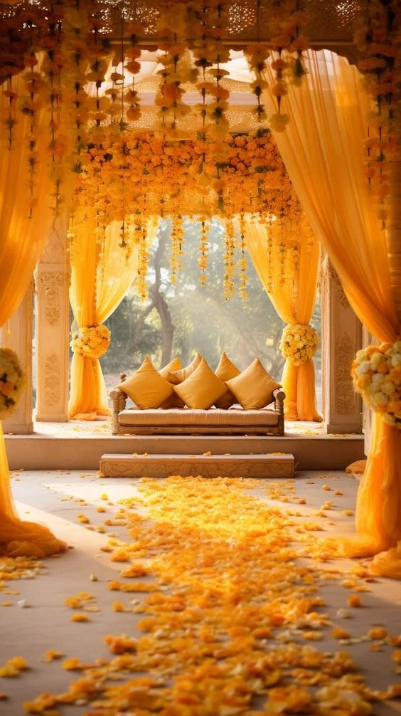
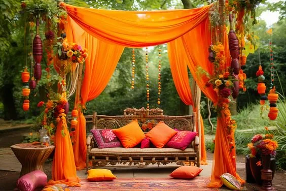
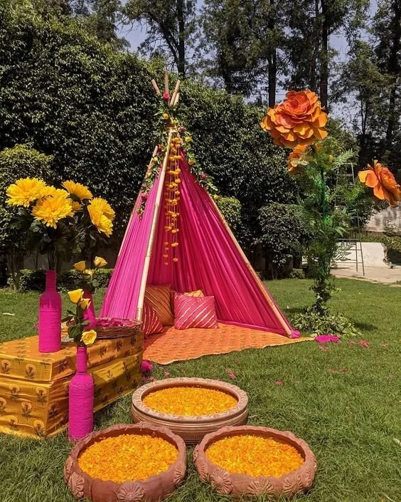
In the heart of traditional ceremonies, color holds a powerful symbolic meaning, especially in events such as the Eldi love ceremony, where deep marigolds and vibrant yellows take center stage. These hues are not just a feast for the eyes; they carry deep meanings that enrich the celebration.
The Symbolic Richness of Marigolds
Marigolds are a staple in many cultural celebrations around the world, known for their bright and inviting colors. In the Eldi love ceremony, these flowers represent joy, vitality, and the renewal of life. Their robust golden and yellow petals mirror the sun's energy, bringing with them a promise of new beginnings and warmth. This makes marigolds an ideal choice for celebrating love and union (Foliage Friend).
The color yellow, especially as seen in marigolds, symbolizes happiness and friendship. It’s a reflection of the sun’s life-giving energy, making every corner it touches glow with a welcoming light. This is why marigolds are often used in ceremonies that mark important life events — their colors symbolize the bright future that lies ahead (Florgeous).
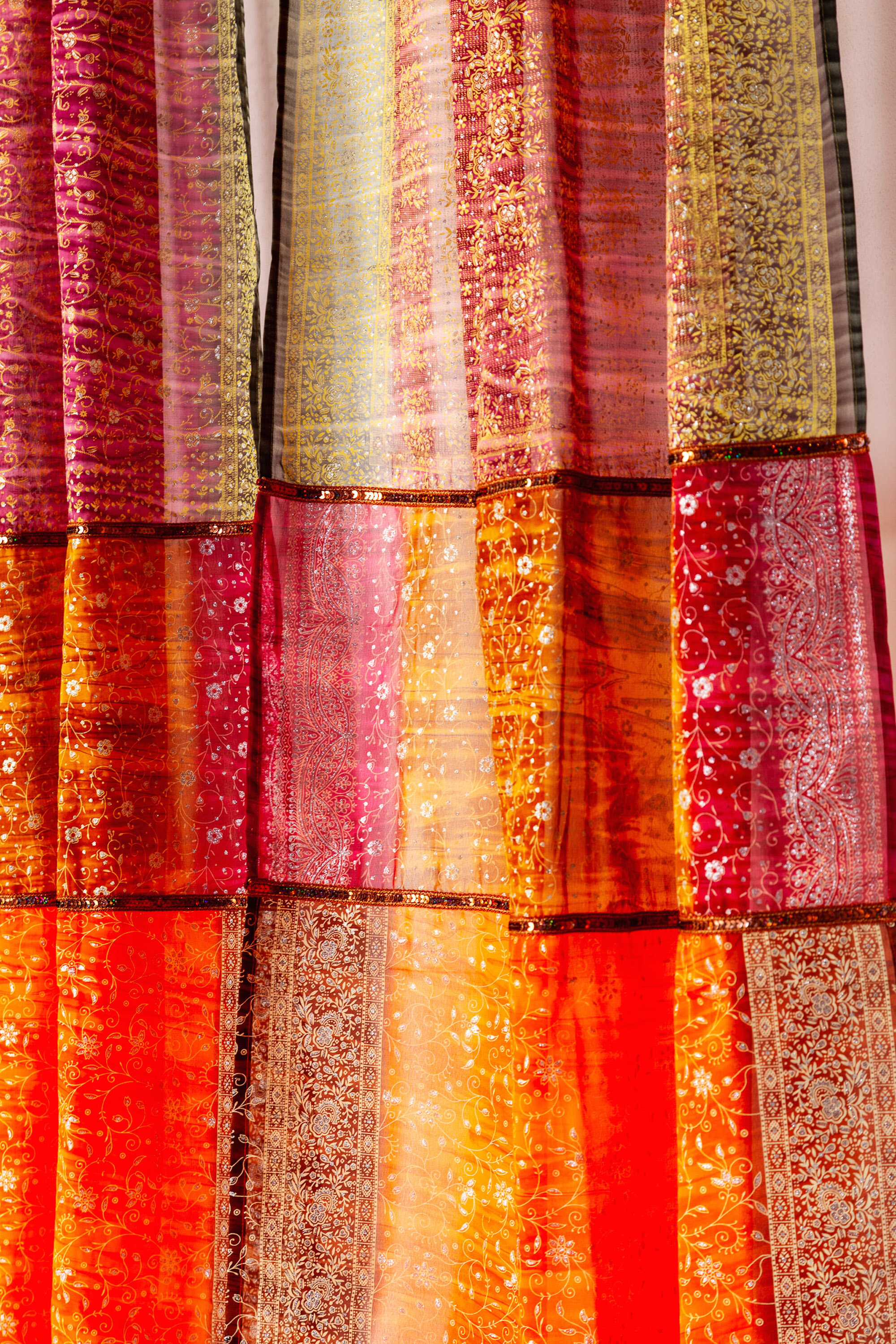
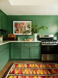
Amber Gold and Yellow Sunburst in Home Decor
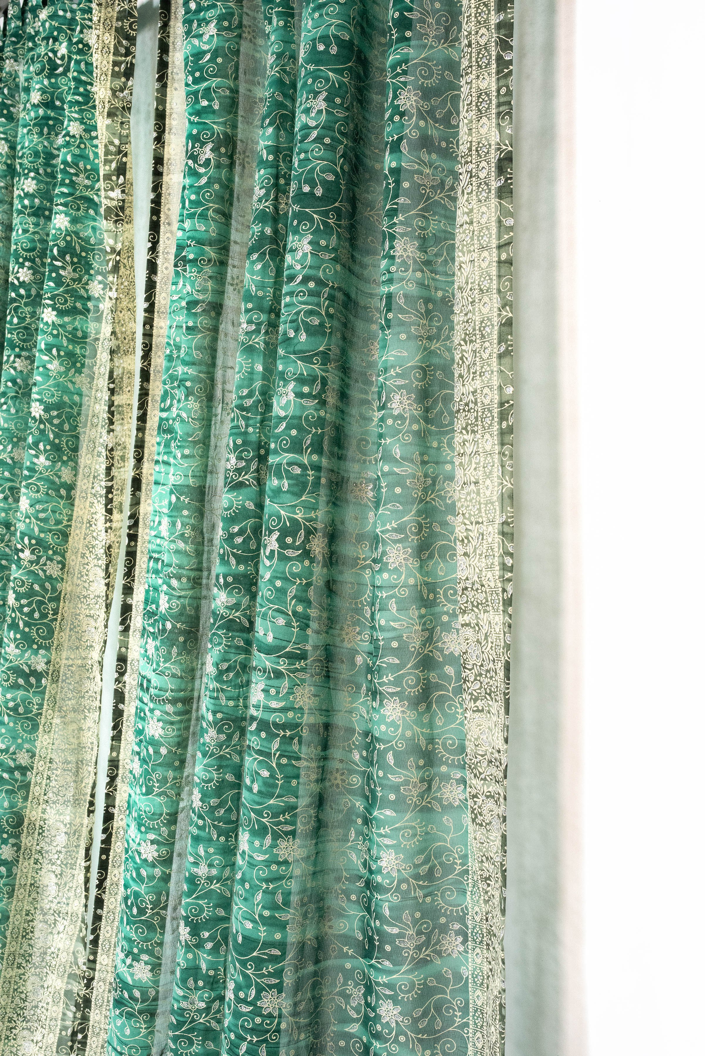
At Colors by Padmini, we carry this radiant energy into homes through our 'Amber Gold' and 'Yellow Sunburst' sari curtains. These best-selling shades have been part of our collection for years and continue to be a favorite among our customers. The 'Amber Gold' curtains drape your living spaces in warm, golden tones that energize and uplift. Similarly, our 'Yellow Sunburst' curtains transform any room into a sun-kissed haven, bathing it in soft, honeyed light.
Why These Colors Matter
These colors do more than just beautify a space; they change its energy. According to color psychology, yellow tones are believed to stimulate the nerves, purify the body, and uplift the spirits. Integrating these colors into home decor through curtains can replicate the warm, positive energy typically reserved for special occasions, making every day feel a bit more joyful.
Furthermore, marigold flowers are not only a visual treat but also come with medicinal benefits. Known for their anti-inflammatory and antiseptic properties, these flowers echo our commitment to not only aesthetic beauty but also to wellness and care in our crafting process (Ace of Things).
Conclusion
As we embrace the vibrant traditions of ceremonies like Eldi with our curtain colors, we invite you to bring this warmth and joy into your home. Let the 'Amber Gold' and 'Yellow Sunburst' curtains from Colors by Padmini be a source of daily inspiration and happiness, turning every ordinary day into a celebration of life and love.
Explore our collection and find out how these spirited colors can transform your home and mood, just as they brighten the most joyful ceremonies.
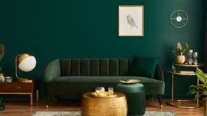
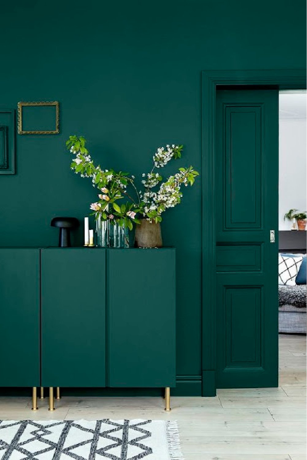
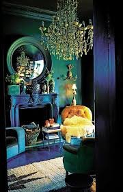
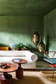

Green Is THE Color of 2024
Here’s How to Use It in Your Home
Shades of green have dominated 2022 trend casting reports across the industry. what this means for home design, and how to make this shade work in our existing spaces.
Green is Versatile and Timeless
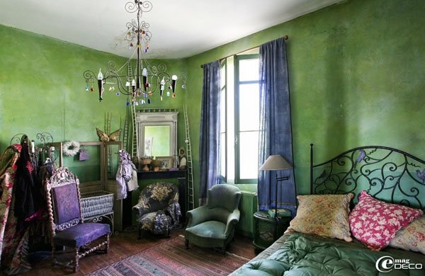
Green is a very versatile color for interiors. It’s an easy way to bring the outdoors in and to give the room a natural vibe. I consider green a neutral when designing a space.
The attraction to green isn’t new but is certainly gaining momentum, Previously, we talked about bringing the best of indoors into outdoor realms. But now we’re seeing a reversal of the trend, with uplifting greens and botanical motifs coming inside the home in everything from paint to pillows.
We are all ready for a new start, and green represents growth, nature, and newness—think budding plants in the spring! We have collectively seen a shift towards calm, earth-tone color palettes in the interior design industry, so green is a natural backdrop to create that feeling in the home.
How to Incorporate Green Into Your Space
Start Small...
If you are unsure of using green in a main room, try it in smaller spaces like powder rooms, foyers, or mudrooms. These accent spaces are great to bring in color while keeping the rest of the home neutral.
Our Textiles: Curtains, Beddings and decorative pillows are a great way to experiment with this verdant hue because they are smaller and make for a great way to break up what is often a neutral space.
Try Evergreen Fog, for a bathroom helps the room feel like an at-home spa.
The tranquil shade of Dried Thyme is reminiscent of eucalyptus leaves, which are often used in spas, making this the perfect hue for those wanting a peaceful respite in their space.”
...Or Go Bold
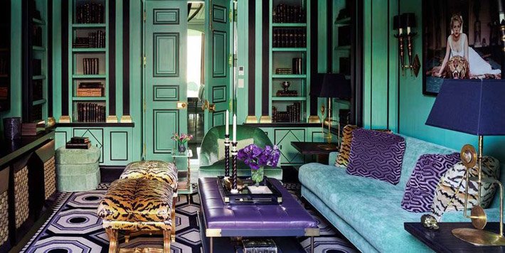
While starting small might be the way to go for some, we shouldn’t be afraid to be bold when it comes to green. We saw a big surge in green on furnishings in the last couple of years—especially on big items like sofas! use it in a major way, like in wallpaper or with a bold paint color,
Explore green as both a backdrop paint color and as a statement color in big furniture pieces.
Consider Your Natural Light
When you’re choosing a green paint color for a room and you’re thinking about the light in the room, you almost want to choose the color that’s counter-intuitive.
Typically, you think you’d want to brighten up a dimly lit room with a light color green, but it’s actually the opposite! Try use a darker deeper tone of green in a gently lit room to play off the moodiness. You can then brighten it up with white linens or furniture. Then, in a bright room, light sage greens or super pale mint shades work really well.
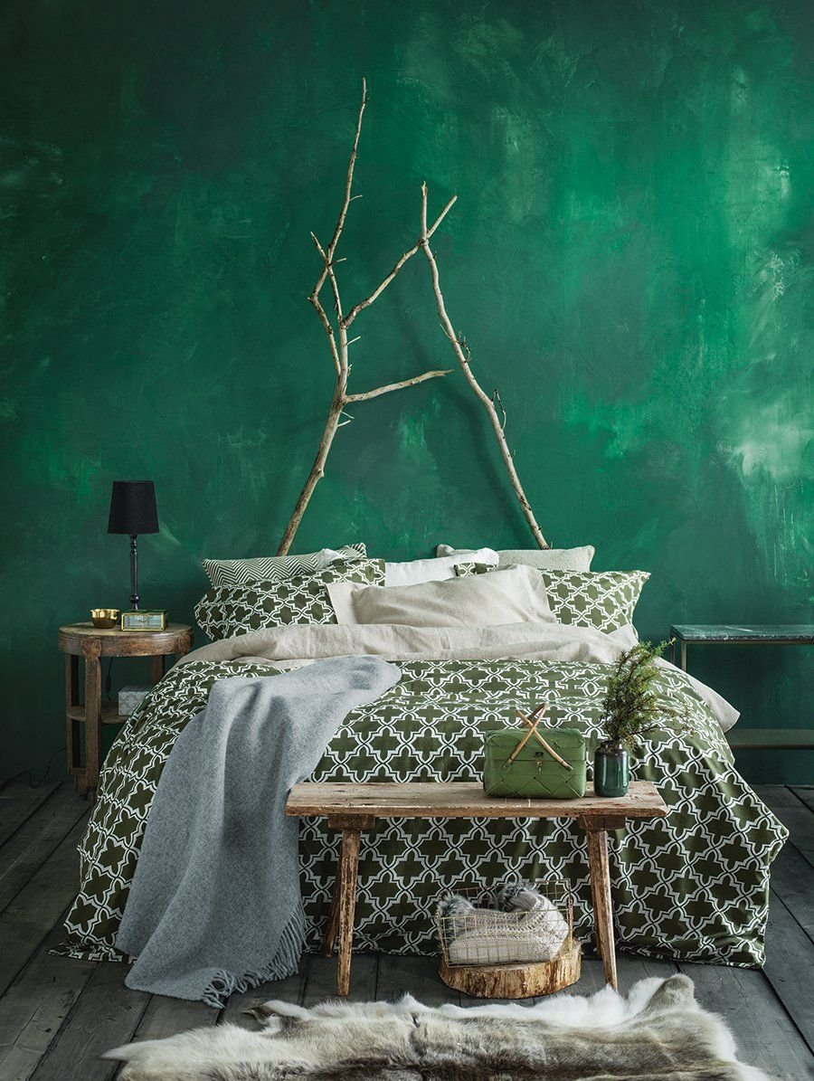
Embracing a naturally dark space with an equally dark, moody paint color, pick a deep, saturated green such as our Pine and Moss Sari curtains, and Make sure to add in plenty of lamp lighting (a fireplace is a bonus!) to maximize the cozy factor.
Opt for Organic Accents
If you’re using a soft green on your walls or with your window treatment, try incorporating other natural elements in the room: wood tones, marble, or iron. Antique rugs are naturally dyed and a perfect choice to ground a color palette.
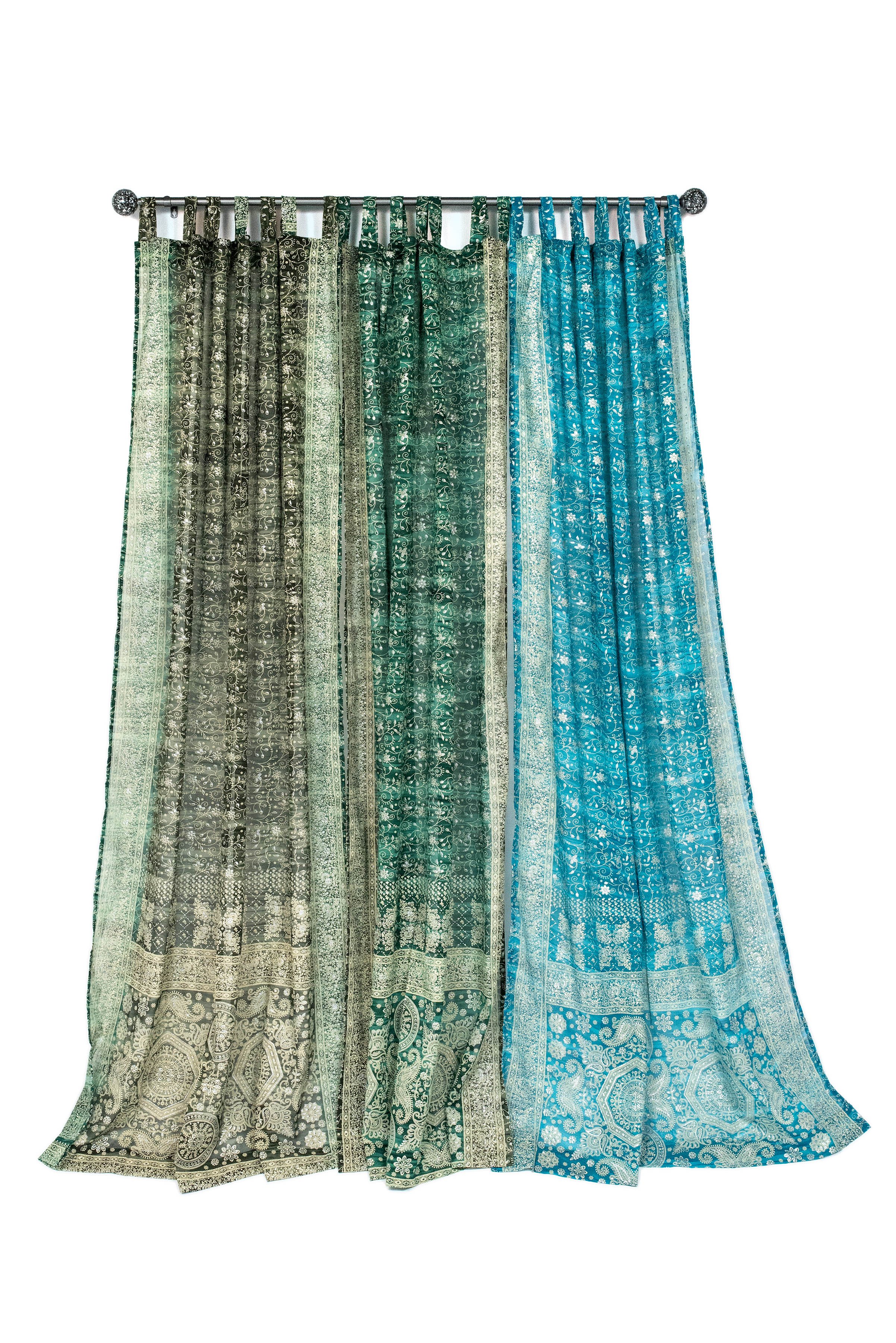
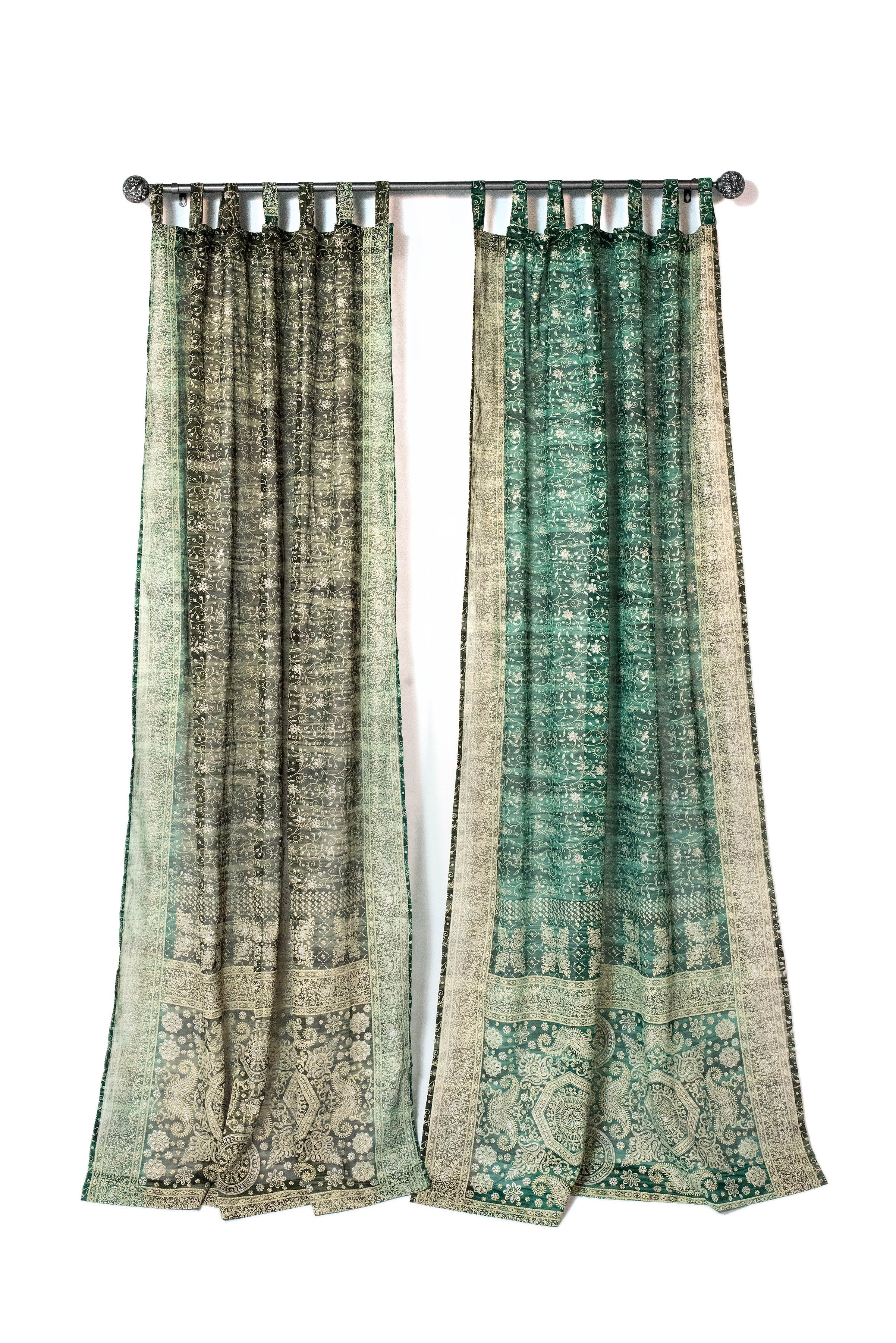
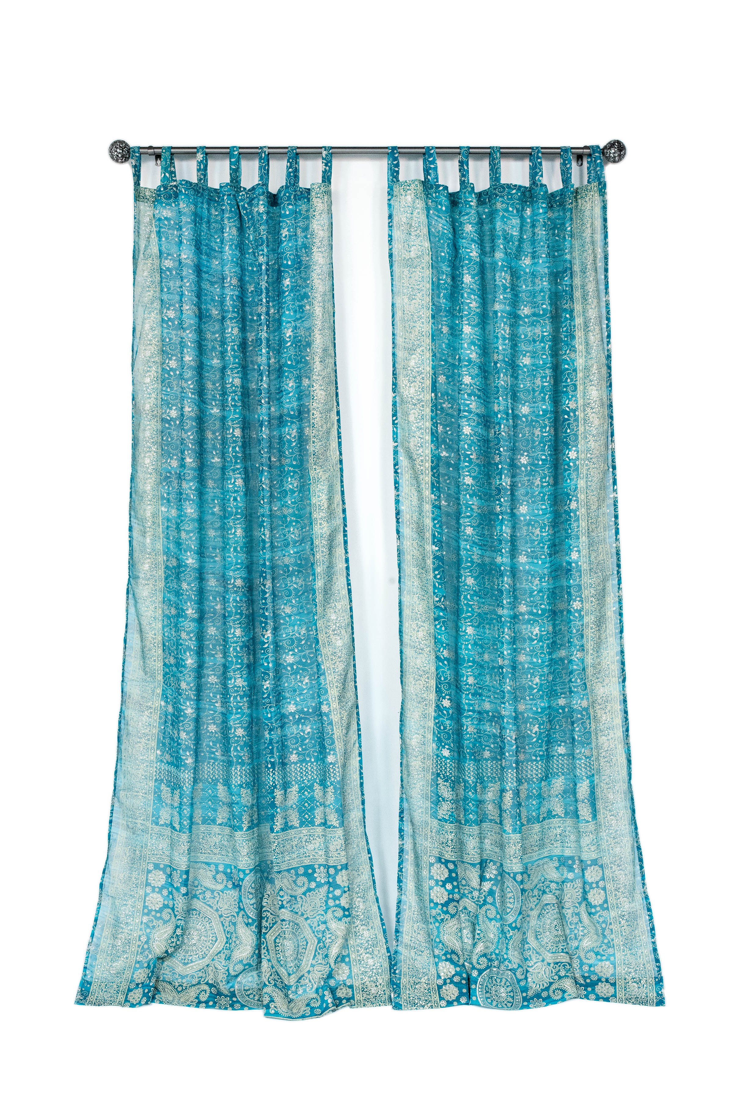
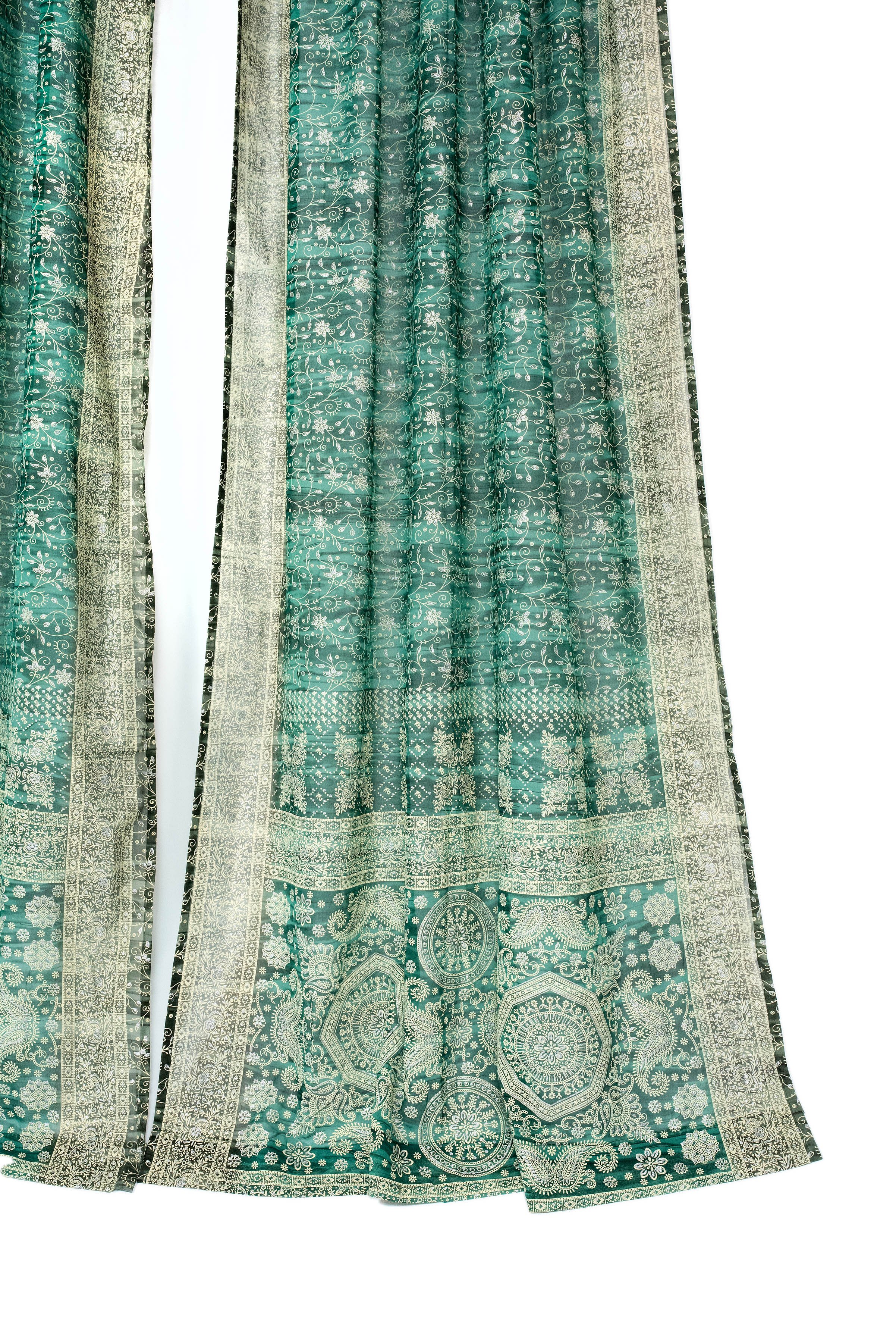
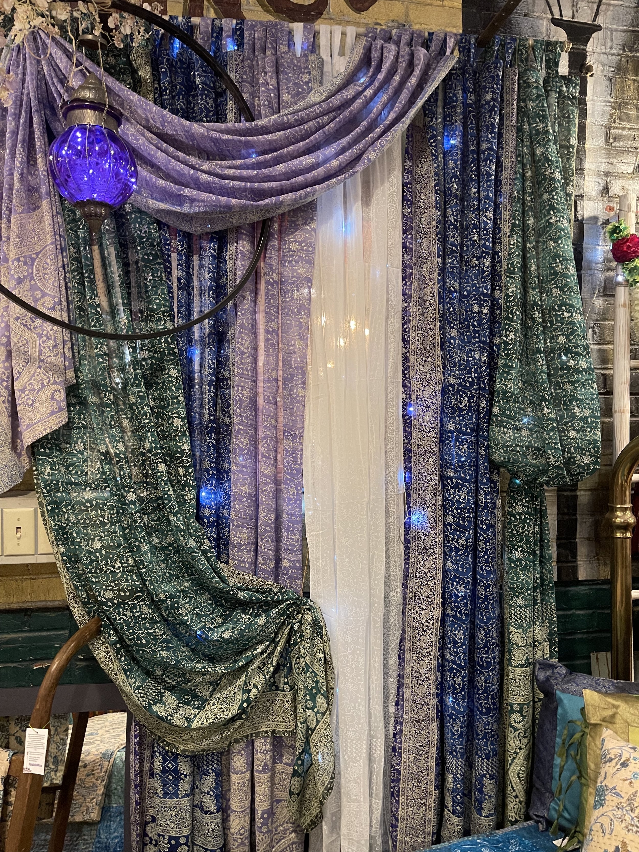
Subject: Create an Elegant Ambiance with Layered Curtains - a short blog on window treatment terminology July2023
We wanted to take a moment to share a delightful window treatment idea that will enhance the beauty and functionality of your living spaces.
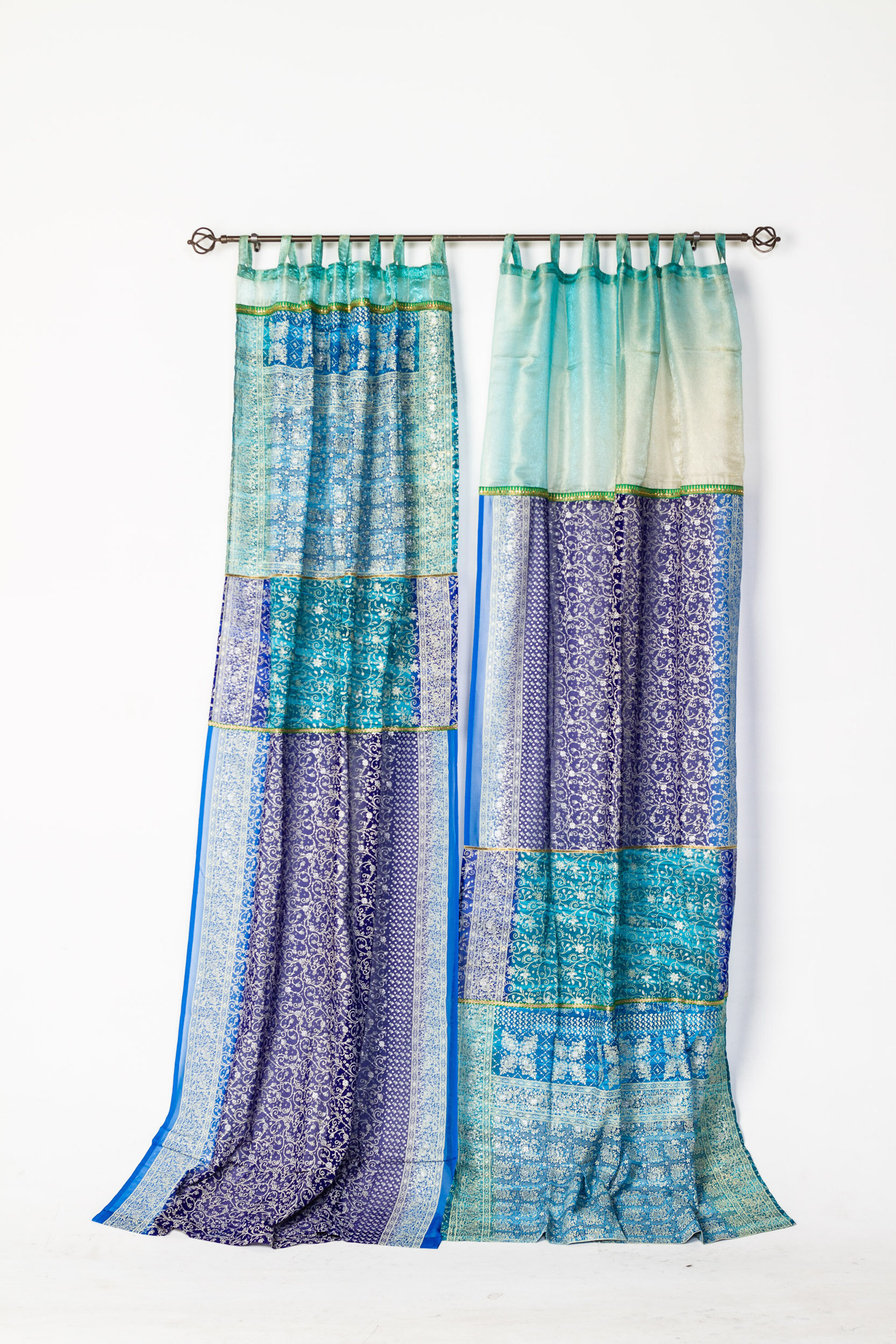
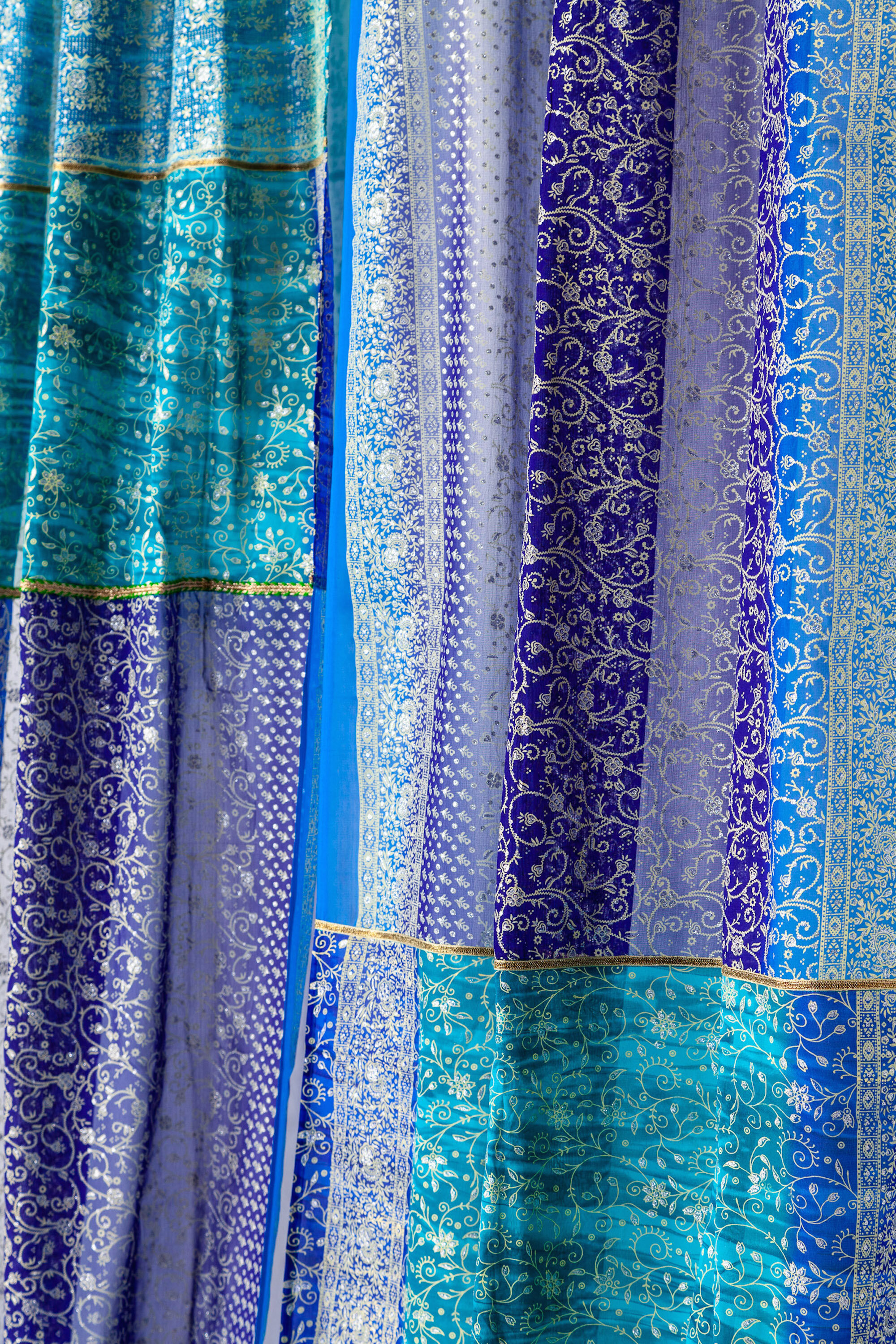
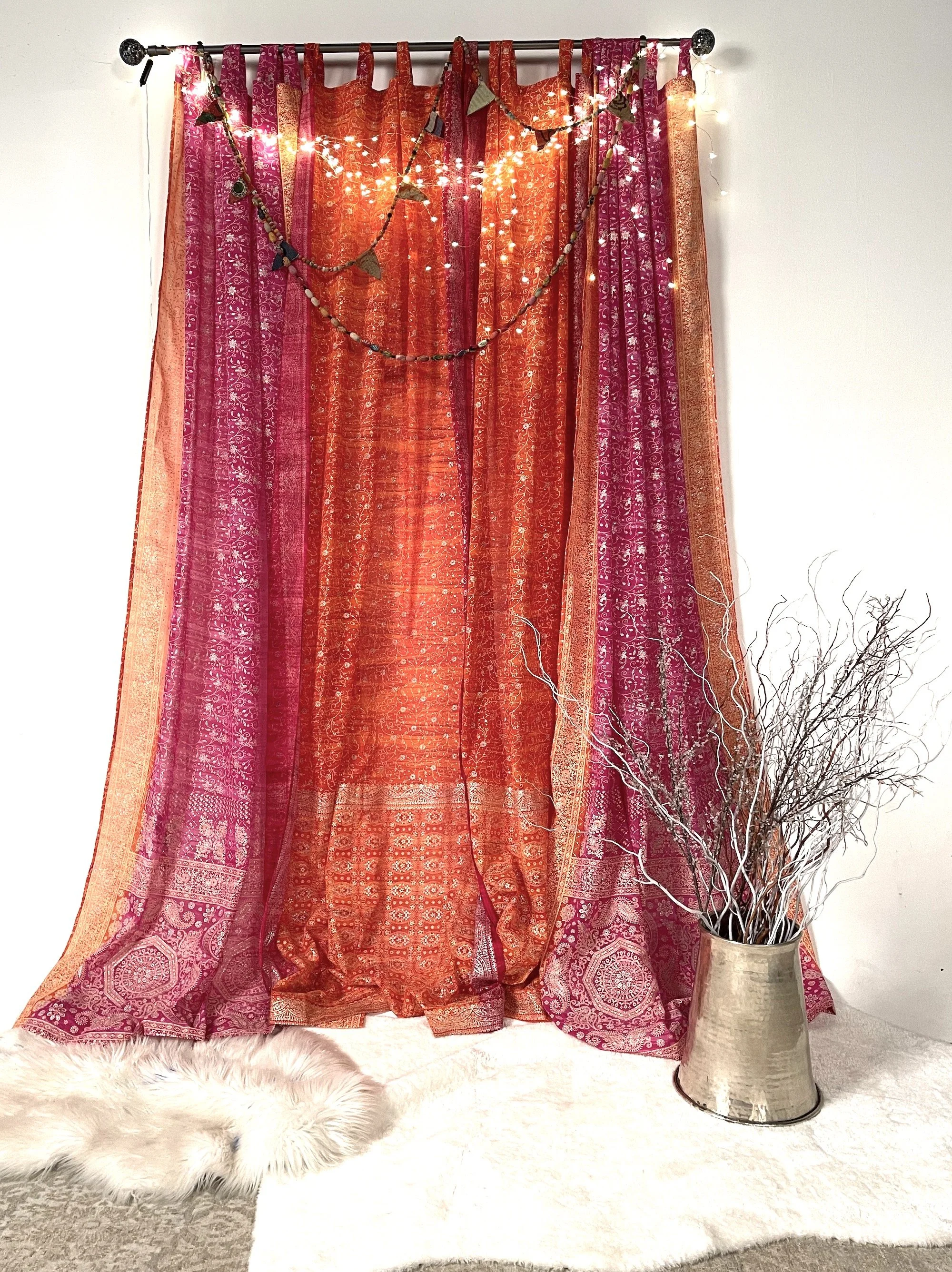
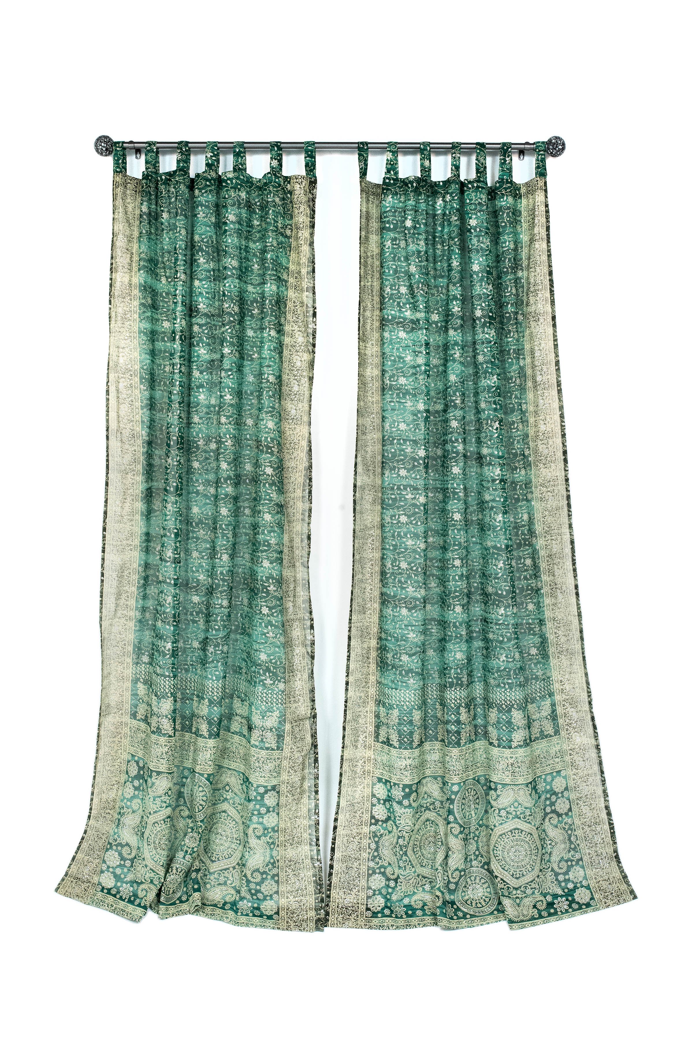
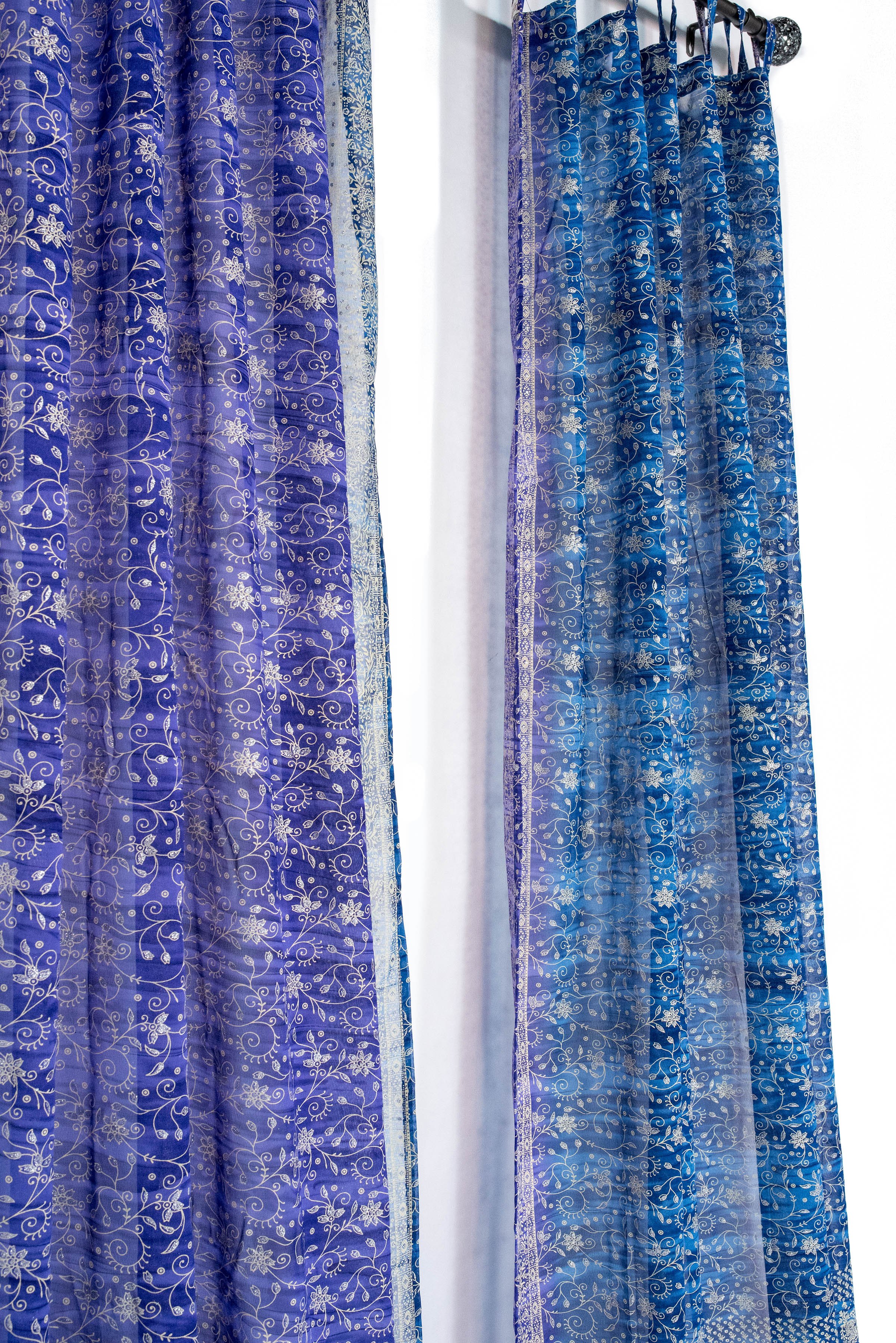
Layering curtains has become an increasingly popular trend in interior design, and we believe it's a lovely look that you'll adore too! By using two light-filtering sheer materials, you can achieve a soft, delicate cover that not only adds an elegant touch but also offers enhanced privacy and protection from the sun's rays.
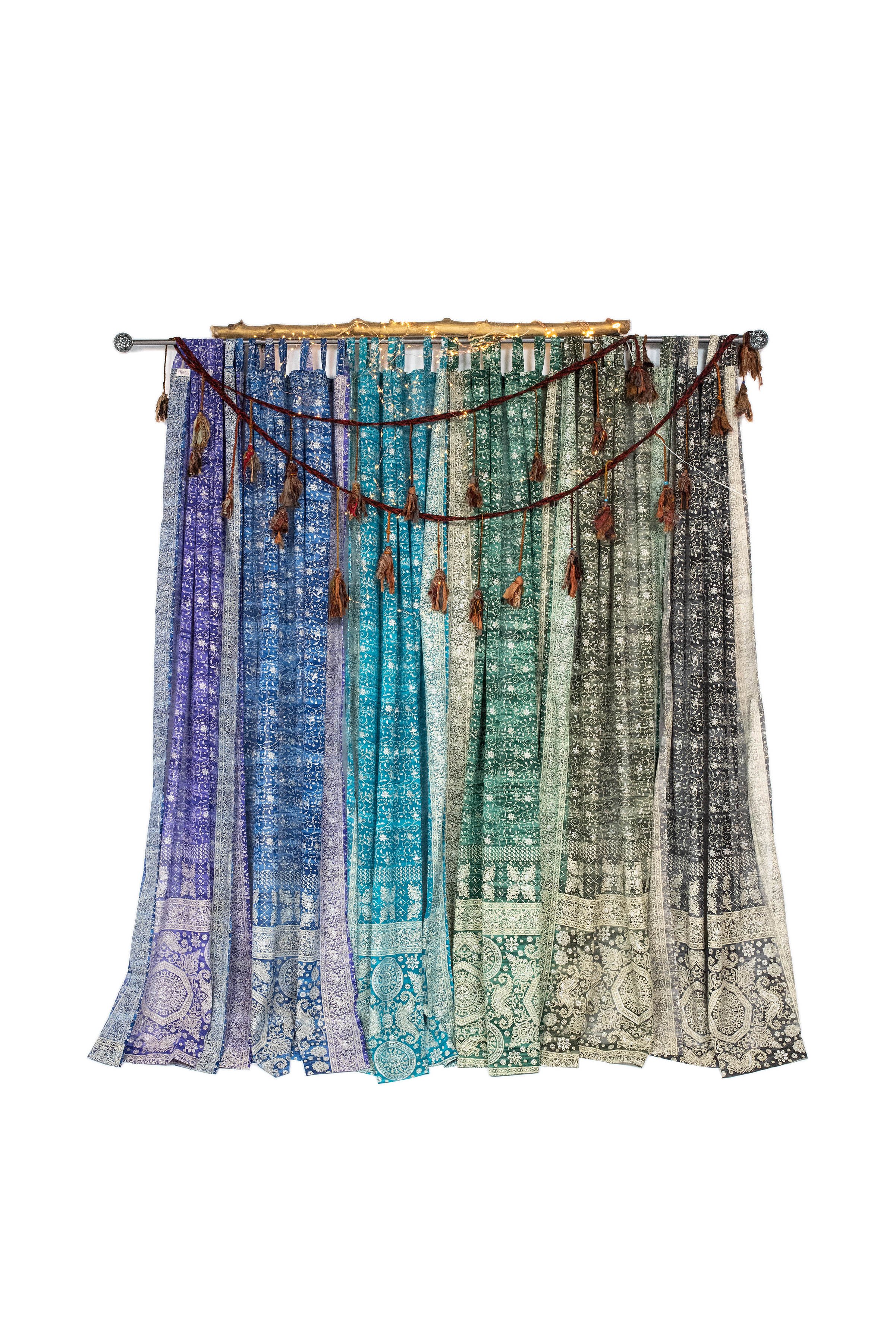
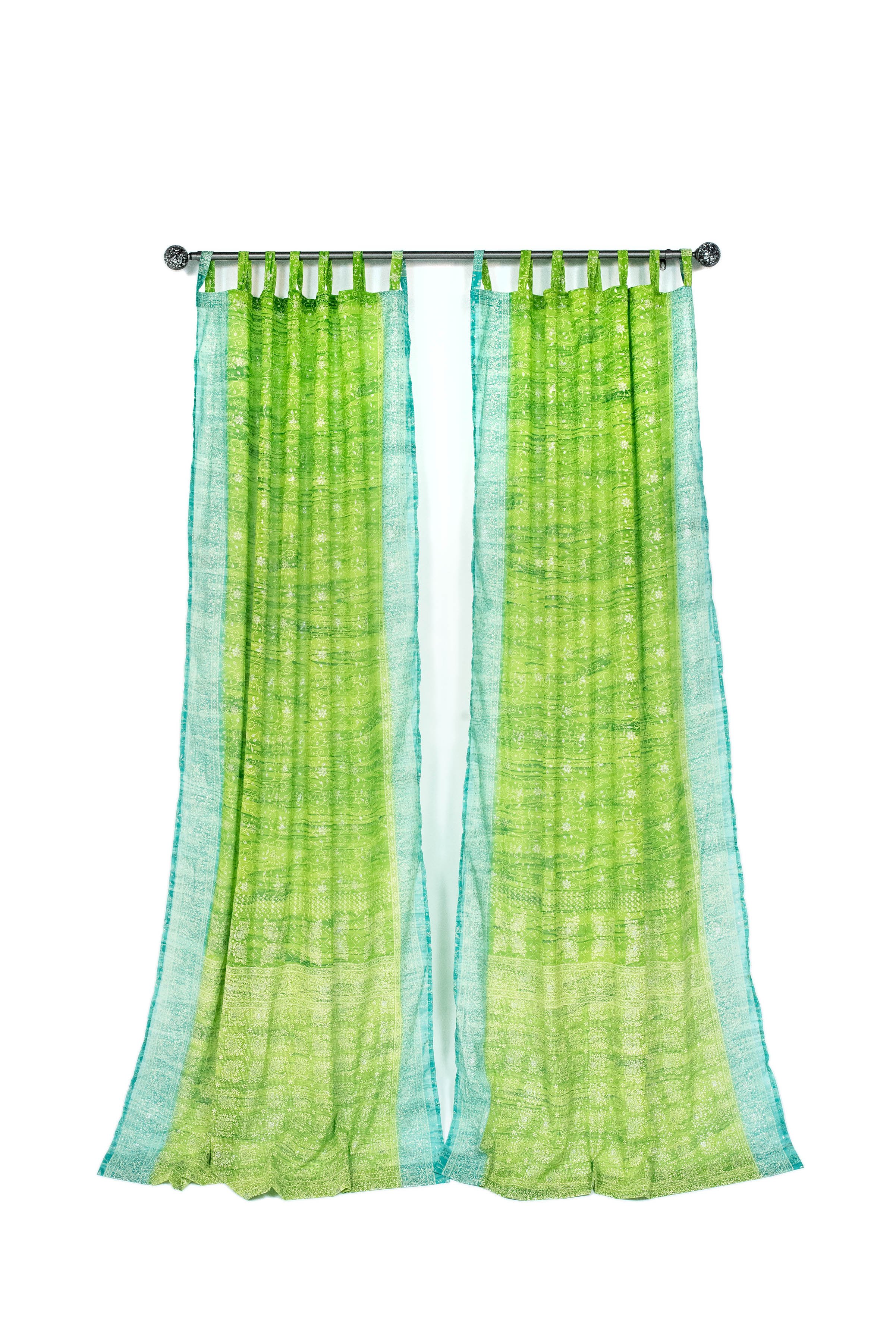
Our curtain panels are designed to complement each other perfectly, ensuring a gorgeous and cohesive appearance when layered together. To achieve this elegant look, we recommend hanging them side by side using tab top loops on the same rod. This will create a seamless and unified appearance, allowing the curtains to gracefully blend together and create a tranquil atmosphere.
The benefits of layered curtains are truly impressive. When you layer two sheer materials, the light filtering effect multiplies, providing a gentle diffusion of natural light throughout the room while maintaining your desired level of privacy. Try it :))
While sheer curtains are excellent for creating an ethereal ambiance, we understand that sometimes you might desire complete darkness . In such cases, we recommend opting for inexpensive blackout curtains (available on Amazon). Use them underneath our Light filtering curtains, it will provide maximum protection from sunlight and offer unparalleled privacy, while enjoying the beautify of Padmini’s Sari curtains, you have now created a serene and comfortable environment.
To summarize, the layered curtain approach with two light filtering sheer materials grants you:
A lovely and elegant aesthetic.
Enhanced privacy and protection from the sun.
Improved energy efficiency through added insulation.
The option to choose blackout curtains for complete light blocking.
We are confident that layering curtains will transform your living spaces into a haven of sophistication and comfort. If you have any questions or need assistance with selecting the perfect curtains for your home, please don't hesitate to reach out to our knowledgeable customer support team.
Thank you for considering our window treatment ideas. We look forward to assisting you in creating a beautiful and inviting atmosphere in your home.
Warmest regards, Padmini team, here to help you create the most stunning window treatment
Pair Small Elements for a Big Impact
You don’t have to paint a room entirely green to still bring in the calming, neutral effect.
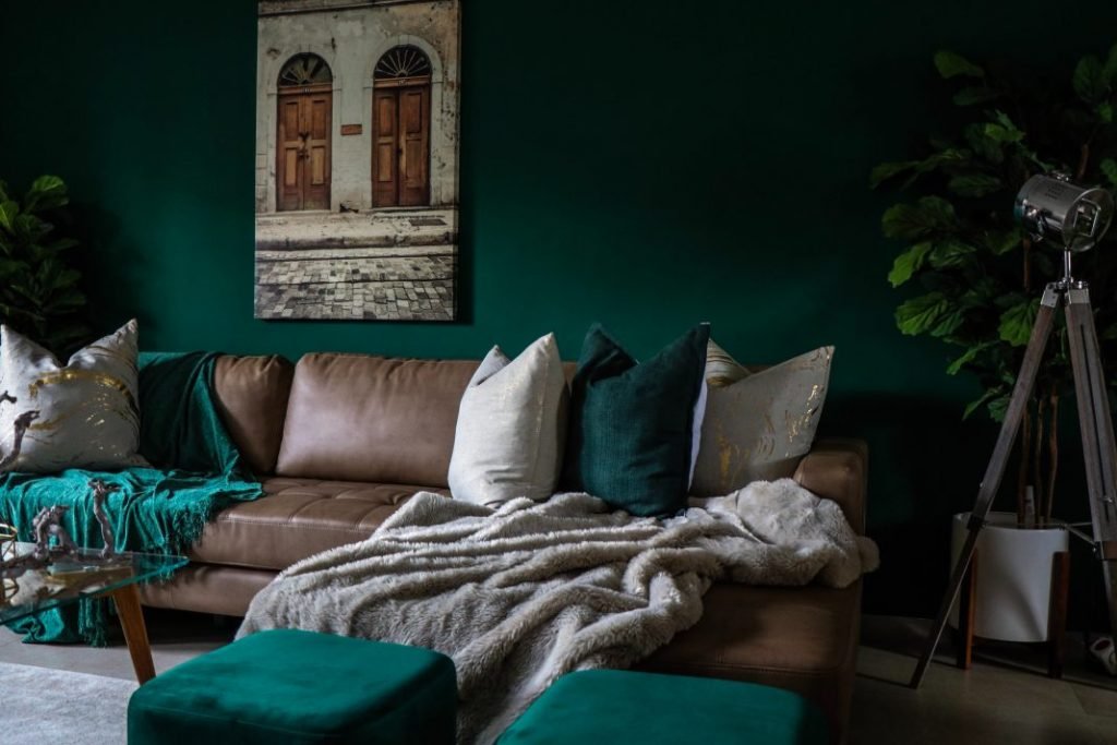
Botanical prints are also really popular right now, especially in textiles and wallpaper, so green is becoming a really popular accent color for trim to complement wallpaper. Green has been a big accent color for upholstery: drapes, throw pillows and beddings—and in lots of different shades from emeralds to olive to sage.
When it comes to selecting green accents, you can be more daring with smaller pops of this hue, too. Chartreuse and olive work well as accent colors for pillows and decor, while deeper and more neutral greens are perfect for walls or upholstery.
We envisions bringing more greens in through accents, including solid, textured fabrics on furniture and and patterned accent pillows. And Let’s not forget about real or artificial plants, too.
Don’t Worry About an Exact Textile Match
If you’re looking for an antique rug to complement your newly green walls or green accent pillows, you might be hard-pressed to find the right tone.
Interestingly, green is a more rare color in antique rugs because the wool had to be dyed twice (blue and yellow), which was expensive.
Don’t feel like you have to find the exact green in your rug or other textiles—play with the green tones and bring in emerald, olive, or jade. Creating a layered palette in color and texture will add a timeless quality to your organic-feeling space.
Try Green in Calmer Spaces
Green is a calming tone, so bedrooms, offices, and playrooms are perfect to incorporate muted greens.
If you’re thinking green is the way to go in your bedroom, we suggest finding a hue that evokes serenity. Green with blue undertones is a great choice for the bedroom as it evokes a feeling of calmness.
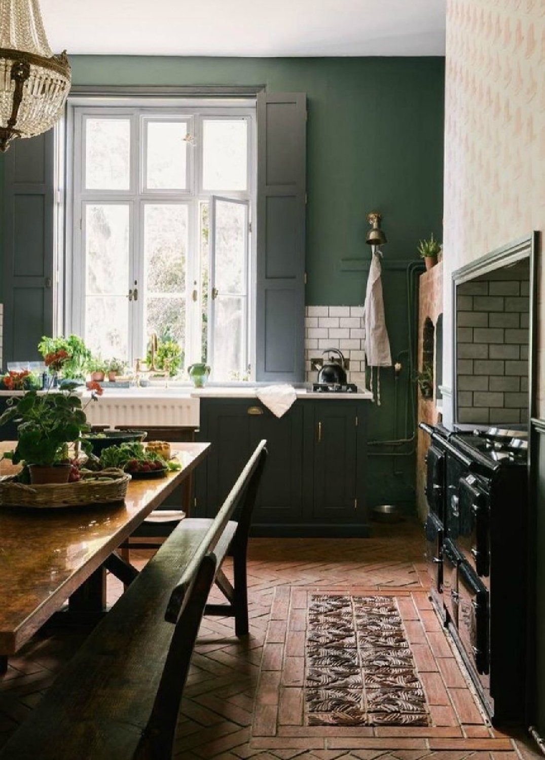
Take Greens to the Kitchen
If you prefer a lighter, brighter green, this is the shade for a kitchen or dining room. A lighter green or green/grey looks best in kitchens and dining rooms. Green is actually a color that compliments food, so any space to eat in and have a dinner party is a perfect spot.
Softer greens are also great in a naturally dark or dimly lit kitchen. Sage green for a dim room, like Farrow & Ball’s Lichen. It looks beautiful against candlelight and creates a great moody vibe.
The great thing about green is that it’s so versatile and you can use almost any shade in any room. Darker shades for kitchen cabinetry right now: deep forest greens, dark sage, and olive or fatigue-inspired colors. All of those colors look gorgeous with unlacquered brass hardware and marble-look counters.
find what works best for your space—especially in the kitchen. Green is one of the nature-based colors that always finds its way into our homes. There is no one way to create a green kitchen, and people should embrace their unique style to make a space their own.
It makes sense that there is so much interest in this warm green color, It speaks to our shared global experience like no other time in history—we are all seeking rebirth.

Hello, Autumn.
As nature traverses through its’ four seasons, we humans can also feel our personal rhythms change. Autumn is, which we often feel intuitively, a time of slowing down, turning inward, and retreating to our nests - a time to delight in the feeling of “home”, and a time to create a sanctuary where we can rest - until nature provides her cues that it is time to emerge back into a more active time.
Here, at Colors by Padmini, we believe in the power of intentionally creating our living spaces to support us through these seasonal transitions - that by attuning with nature in our interior design, we can enhance our inner peace, protect our health, and nourish our spirits. Over the next few months, we’ll be highlighting the foundational elements of Vastu Shastra, an ancient Vedic science of space and design, that offers a path to optimal energy flow and harmony in our interiors. We hope to support you in living a conscious, natural lifestyle beyond simple design - by bringing your dwellings to life.
Home as Sanctuary
Vastu literally means “energy”. Vastu Shastra is a means by which prana or energy can flow freely within our homes. It is more than a system of design, but a way of working with the energy of your space that suits your own sense of style and beauty. Our lived environments are extensions of our innermost nature; we want them to be an expression of our true selves and, also, nurture the lives we desire. Our aim is to create a garbha-griha or “womb chamber”--a safe and loving environment for nourishment, where we forget about the uncertainty of the outside world.

Lush Earth collection
The Seven Sources of Prana
In Vastu Shastra, there are seven ways to increase the flow of prana in your homes. You can do it with our color collections and the elements:
1. Open the windows, especially in the northwest quadrant of the home where the prominent element is air.
2. Fill your home (both indoor and outdoor) with live plants, cut flowers, and gardens.
3. Create open concepts and views such as a vamsa danda, a spine of light, that runs from the front door to the back door / window.
4. The center of the home, or brahmastan, is the sacred space where all directions meet, and should be left open, if possible.
5. Fill your home with fresh, organic, living, and pranic-rich foods.
6. Add water elements (indoors and outdoors), such a bowls of water, vases, fountains, and/or ponds.
7. Practice meditation and yoga .
Design Highlight: Master Bedroom
According to Vastu, colors have a significant effect on the energy of a space. Along with the location of the bedroom and the placement of the bed, they play a key role in our disposition, health, and overall well-being. It’s important to remember that our bedroom is primarily a space for relaxation and rest. It is our place of rejuvenation. Our intention should be to keep the space peaceful, using soothing tones.
Here are a few Vastu colors options for your bedrooms:
1. pink or light red tones
Pink and Light Red Tones represent warmth and love. This is a great color for a master bedroom, and according to Vastu, is perfect for couples, as it deepens love bonds and resolves conflict. Avoid deep and dark reds as they signify high emotions, heat and anger.
2. green tones
Green is a positive, relaxing color that helps the mind-body unwind after a long day. It is a great color for children’s rooms, since it symbolizes learning and the quest for knowledge.
3) orange tones
Soft orange tones symbolize healthy and vitality. In it’s fiery essence, it stimulates feelings of ambition, and is believed to be a good choice for students and young, goal-oriented professionals. Be mindful of orange if you’re prone to a strong temperament. In such a case, choose cooler colors to calm the mind.
4) brown tones
Brown and other earthy shades create a sense of grounding, stability, and permanence. According to Vastu, it’s a great bedroom choice to imbue a sense of inner peace and contentment.
5) purple tones
Purple is calming in nature, making it another good bedroom choice, according to Vastu. It helps to calm the mind, enhances the quality of sleep, and encourages happy dreams.